Thursday 20 December 2012

Do's and Don'ts

 
This screen grab is a clear spread sheet made on word which highlight the things we should DO for the conventions of our digipaks. i have made the "DO'S" on a creative sheet so i could remember them better and to make sure i work accordingly with these conventions.
 
The DON'T'S
 
  • STRETCH IMAGES
  • USE LAYER STYLES
  • USE UNNESSASARY EFFECTS. ANY EFFECTS USED MUST SUIT THE GENRE
  • PLACE TEXT ACCROSS THE ARTIST'S FACE
  • USE FONT SIMPLY BECAUSE YOU LIKE IT
  • FEEL YOU NEED A SEPERATE PHOTO ON EVERY PANEL - BE CREATIVE

The images i have selected for my digipak

Miizkraziness's digipak photos album on Photobucket

Decision on album name

Different Words We Could Have Chosen...


We typed in "Alone" into thesaurus.com because we wanted to come up with a synonym for the word so it will suit the theme of our music video. We chose "Solo" out of all of these words because, as a group, we all Favorited this the best.

My photos :)

These are the pictures I took for my digipak 


Shortlist of Fonts


Developed ideas for Advertisement :mock-up 2

 I have developed my ideas by making my advertisment landscape instead of portait. I did this because the portait format seemed to almost force me to follow the conventions of a magizine rather than a music advertisment. This also allowed me to place text on and other conventional things along the side of my image.
However, after thinking again, the image i used (shown above) is not suitable for my advert as her hands are then main focus instead of her face. In order for us to recognize her as a new artist in the industry is by selecting another image makes her face the main focus but still look interesting.

Planning-Developed ideas for digipak (inside Panels)

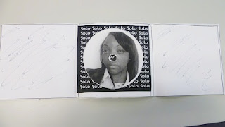
My digipak's inside panels caused a slight concern after showing my teacher so i thought it would be a good idea to change up the placement of images and instead of having her face in the CD section, putting words there would make it look morre proffessional.

I have developed my ideas by deciding to have two of the same image on the two opposite panels reflecting each other. This will add more meaning of creativity through the thoughts ive made on my work rather than making it plain.

Ancillary research: Inspiration from Advertisements


I have taken it upon myself to carry out research on existing album advertisement for artists. I have selected these three as they are all different and each of them have a distinctive and unique look to them. They all have different themes and the images of artists used are edited in a form to convey visual links throughout.
I found this research helpful as it allowed me to have an idea of how i could make my advertistment look and make everything go together in terms of the theme and a interesting image that i may use.

Ancillary Research: Inspiration from Digipaks

 I decided that it would be a good idea for me to look at existing digipaks in order to gain inspiration for creating mine so i went onto google to search for mainly female artists and at a wide range. I discovered that each of them had their own unique way of convey their artist to catch the eyes of viewers. This played as an influence to me as to how i can construct my product and make it as equally unique and proffesional.

Monday 17 December 2012

Thoughts on Images used for Ancillary


Towards the end of producing my mock up for my digipak i began to think again about images. I thought that it would be best to have another photo shoot where we would have not only a wider range to chose from but making them look much better. The images we have here shows our artist having quite the same emotion in each shot and they all turn out to not have been as "expressive" or giving our "artist away". Bearing in mind the the images are a strong convention of Ancillary work it is important we re-shoot them tomorrow whilst thinking carefully with the presentation we are trying to give with her.

Mock up Advertisment


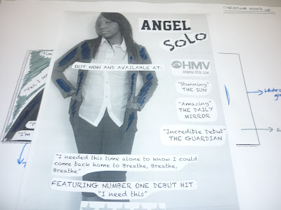
Here is the mock up for my advertisement. For this i will stick to using an A4 portrait for this part of my production. This is mainly because i find interesting to have a long-shot of our artist on it (once again there will be a change of image which may expand on the idea in convey through the final).

I kept in mind that it is important to have a formal layout for this part of the ancillary (conventions listed along the side) so its clear and conventional.
The feedback i received for this piece was to have a neater positioning of certain parts on the conventions (where quotes and stars should be placed).

Mock up digipak


 Doing the mock up for my digipak has helped me become familiar with the conventions more and has given me the chance to be more flexible as it is practical work. As i started on the template i went through the images i thought would work best for the the panels. After choosing, i continued to refer to the conventions on the written guide given to up which helped me with gathering pieces together towards making it look more  realistic and proffesional.

As shown below i have decided to produce a 6 panel  template for my digipak. After pitching it to Rebecca(teacher) i was given feedback which made me aware of a few mistakes i made. Firstly, i needed to have a few more record labels and information, however, I managed to position the layout of conventions around in appropriate places.

As shown below, i haven't managed to go into it with much detail as i have been spending much more time on deciding on ideas which would make it look unique. The fault noticed on the inside panel of my digipak was the CD. The feedback given to me was to perhaps use the album name i used for the background of the middle panel for the CD rather than her image (it appeared "wrong"). What i intend to do with the side panels is either have to images that have an interesting connection or a sense of reflection. I also have an idea if having images of scenes used for the music video in them or photos of her recording in the studio (benefit of fans)

Overall, i found this task enjoyable and creative!

Final mock up of advertisement


Final Advertisement Mock Up

This image shows the final mock up of my advertisement. Just like the digipak, I will make a few alterations to it. For example, this mock up was done on an A4 sheet, but for my final product this will be done on an A5 piece of paper which will allow me to space out the information.


Using an A5 sheet will also allow me to add in a picture of the front cover of my digipak,  which is what I intended to do but wasn't able to.

Final mock up of digipak


Final Digipak Mock Up


1st day of digipak mock up - on sheet

In-class mock up of digipak


These two images show the mock-up of the digipak I will soon be making; to help the production process easier for me, I made notes all around the sheet so I would know exactly where I will be positioning everything I will be putting on my digipak, what colours I'll use etc.


Photoshop practise - Dan london

1st Day of Photoshop Practise


This image is a photo of the practise picture we used in order to try out our Photoshop skills and learn how to use the different functions of it as well.


This image is the same picture but it is edited.


Blogging: Images i chose for my Digi-pak


This image I chose for the inside of the CD case with lyrics specifically chosen to evoke the audience's feelings. I chose this picture as it is a good promotion picture, it shows who she is, she's looking directly to the audience and it choses of the brightness of her blazer which is one of our main colours
This picture i put on the back of the cover of the CD case, i did this because i think she is in a perfect position which goes with my idea of having a Track list beginning from the left of the cover and fits right along 'ANGEL' in this image, it perfectly shows of the significant colours we have chosen especially with a bright white background which makes her stand out and her blazer, this picture is what encouraged the idea of a 'white glow' around the image for the digi-pak.

This is my main image that i used on the front cover of my album, it is more or less a closeup of my artist and it perfectly shows of the mood of the album and emphasises the emotion your'll feel from listening to it, she is positioned in a way to evoke feeling to the audience and she perfectly stands out in the chosen colours of our house style to make it very effective


Blogging: Advertisement for Mockup


Changes to be made to Advertisement:

- Make 'SOLO' straight and not slanted
- Get rid of Jessie j lyric on the cover 
- Research what is meant to be on an advertisement and the bottom
- Put a record label on the advertisement eg. Sony

Blogging: Mock up Digi-pak - Inside of the CD


Changes to be made to mockup:

- Never have words slanted so get rid of the lyrics that are slanted 
-  Change Solo so it looks like the circle is the actual 'O' in  'solo'


Blogging: Digi-pak Mock up - The Outside cover


Changes to the mock up:

- 'Solo' not to be slanted but to be straight.
- Show Rebecca what the white glow is to look like on the digi-pak before it is actually made.
- Never have quotes on the back of the pack.